We all know that companies try to trick us with deals, bargains, and other eye-catching assortments. But some of these methods can be more subliminal and clever which will grasp you without you noticing it.
Some of the world’s biggest companies pay big money to designers, advertisers, and psychologists to dream up creative logos that convey an image you might not initially see.
How many of these 35+ “hidden” images revealed in plain sight did you initially miss?
FedEx
via: FedEx
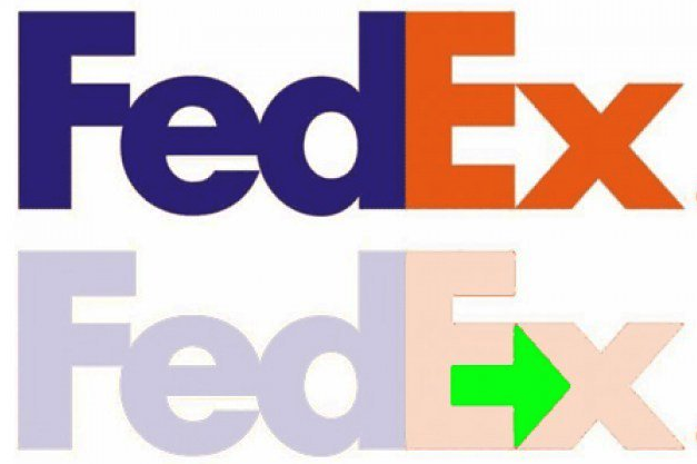
This is one of the best-known logo images, but just in case you’ve missed it, look between the “E” and the “x.” In the white space, there’s an arrow that subliminally represents speed and precision.
FedEx (in Arabic)
via: Reddit
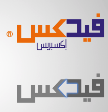
Interestingly enough, FedEx made sure to include the arrow in the logo used in Arabic-speaking countries, too. You probably noticed that this arrow appears to point backward. That’s because Arabic is read from right to left.
Wendy’s
via: Wendy’s
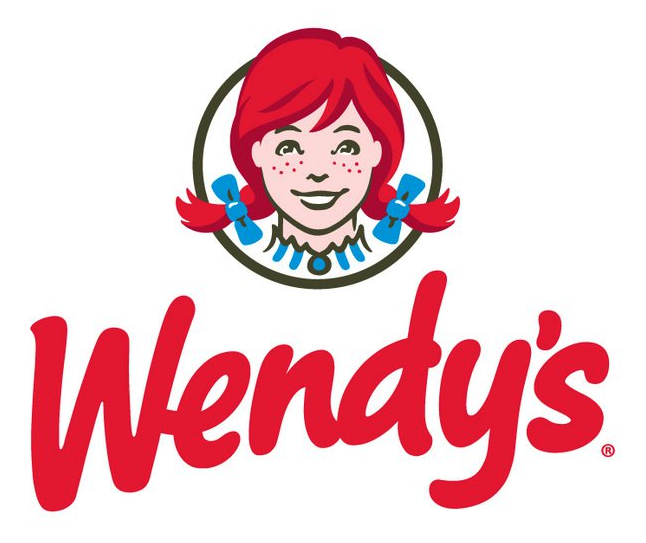
This Wendy’s logo appears to say the word “Mom” in Wendy’s collar, suggesting that their cooking is like Mom’s home-cooked meals. You know, if mom made square hamburgers and served ketchup in small paper cups.
Pittsburgh Zoo
via: Twisted Sifter
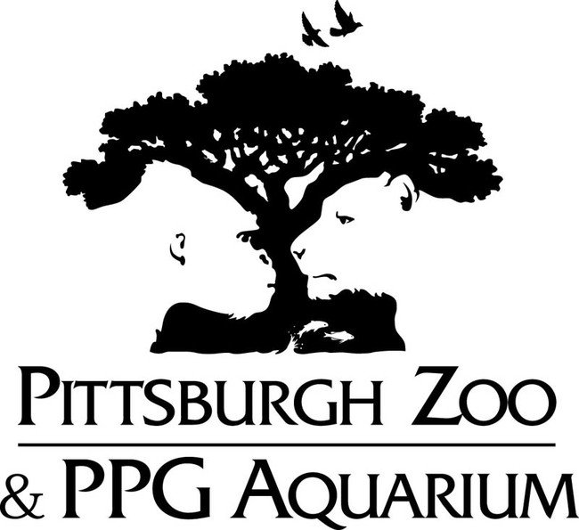
The white space in this logo pops out and reveals a gorilla and a lion staring each other down. While the ape is quite a beast, my money would still be on the lion. He is king of the jungle, after all.
Chick-fil-A
via: LogoPedia
The Chick-fil-A logo incorporates a chicken into the “C.” Although this isn’t very hidden, it is still pretty clever, more so than their attempts to have people believe that their meals are nutritious.
NBC
via: Twisted Sifter
Considering they’re often referred to as “the Peacock Network,” among other things, this one is rather obvious. But the symbolism of the colored feathers represent each division of NBC (from when the logo was first designed, as there are more now) and the head of the peacock is looking right, meant to symbolize looking forward (to a show that can compete with “Mad Men” and “Modern Family.”)
Amazon

via: Corporate IR
Not only is the Amazon logo smiling, but there’s also an arrow starting at the “a” and ending on the “z” to indicate that Amazon has everything from A to Z that you don’t need but will buy so you spent enough to qualify for free shipping.
Baskin Robbins
via: The Culinary Scoop
Here’s the scoop: Famously known for its 31 flavors (supposedly so that a customer could have a new flavor every day of the month) Baskin-Robbins makes it known in their logo.
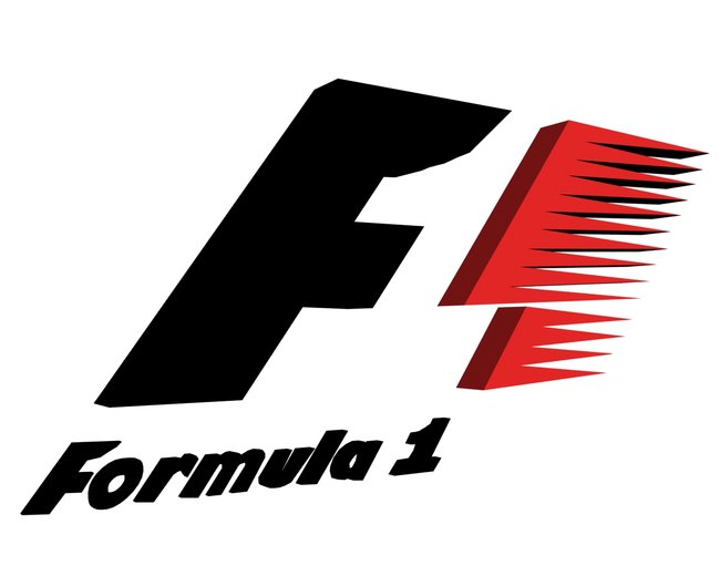
Formula 1
via: Wikipedia
Zoom your eyes over this racing logo and you’ll see the empty space in the middle creates a number “1″ for “Formula 1.″
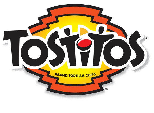
Tostitos
via: Twisted Sifter
While you were shoving chips in your face you might have missed that there was an actual fiesta going on in the Tostitos logo. Yes, the two t’s are partying over a bowl of dipping sauce that dots the “i.” Olé!
Atlanta Falcos
via: Logo Kid
The NFL team’s logo is much more than a really cool looking bird. Rather, it’s a really cool looking bird in the shape of a big letter “F” for Falcons and other four-letter words disgruntled fans might utter throughout the season.
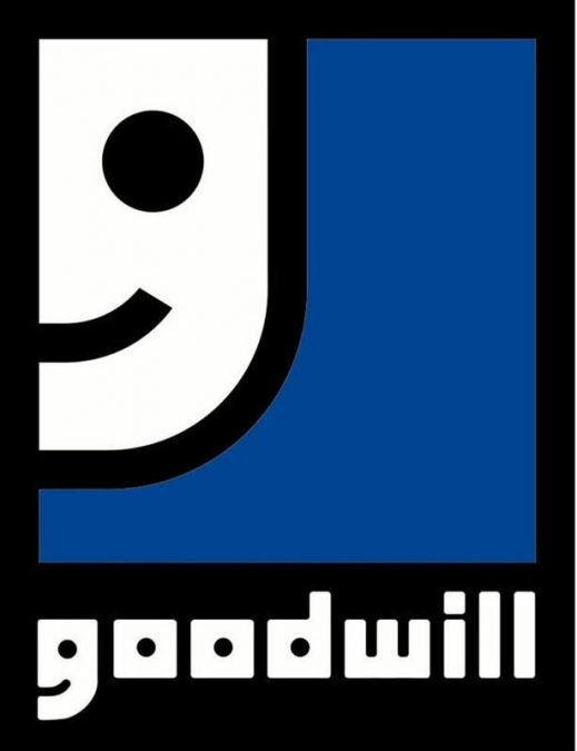
Goodwill
via: Twisted Sifter
Because giving (and saving) should make you happy, the “G” in “Goodwill” is zoomed in and cropped to form a smiling face.
Sun Microsystems
via: United Contact Center
In this case, look directly at the sun (and only in this case, unless you want to burn your eyes out). Actually, look directly at the diamond and you’ll see it says “Sun” in every direction.
Le Tour de France
via: Twisted Sifter
There is a cyclist in there, literally, on “Tour.” Notice how the “o,” “u,” and “R” all come together along with the yellow dot to form the image. Immediately after posing for this logo, he was taken in to pee in a cup to be tested for performance-enhancing drugs. Results are pending.
Hershey’s Kisses
via: http://static.twentytwowords.com/wp-content/uploads/hersey-kisses-logo-large1.jpg
Want a free Hershey Kiss? Check the front of the bag. OK, it’s a bit disappointing that it’s not actually a piece of chocolate, but if you look between the “K” and the “I” you just might find an extra one, at least visually.
via: Pinterest
Considering the point of Pinterest is for users to “pin” things like projects and recipes they’ll never create to virtual boards, it makes sense that the logo incorporates a pin into the letter “P.”
VAIO
via: Stock Logos
At first, all you see is modern typography, but there is actually a hidden meaning of Sony’s VAIO logo. The first two letters represent an analog signal and the last two are the 1 and 0 of the digital world.
Hartford Whalers
via: Twisted Sifter
This former NHL team is no longer in existence, but the logo was so clever that it warrants a mention. The “H” can be spotted in gray and the “W” in green, but did you notice the blue tail of the whale? They shoot, they score!
Toblerone

via: The Logo Factory
The Toblerone logo contains the image of a bear hidden in the Matterhorn mountain, which is where Toblerone originated. And because if you live in the mountains with bears, you need good chocolate to survive.
McDonald’s
via: Get Primatic
Everyone knows about the Golden Arches and that the “M” stands for “McDonald’s.” But what you might not know is that in the 1960s design consultant and psychologist Louis Cheskin said customers unconsciously recognize the logo as “symbolism of a pair of nourishing breasts.” I think the dude just needed a date.
Pretty clever, if you ask me.
The Bronx Zoo
Twisted Sifter
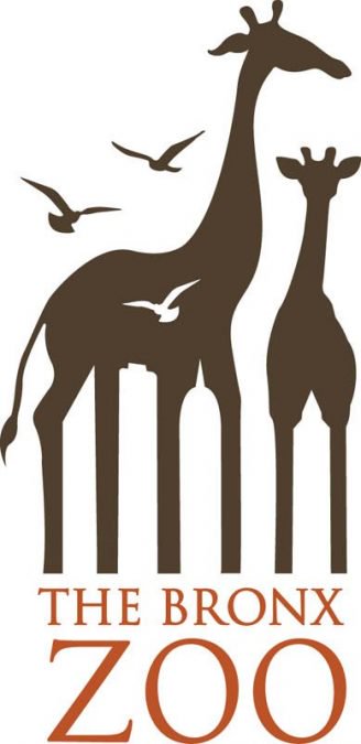
The negative space in this logo reveals New York’s iconic skyline of tall buildings between the legs of the giraffes which, quite honestly, looks a little painful to me.
Beats by Dre
via: Imgur
Here’s a logo you’ve undoubtedly seen all over the place.
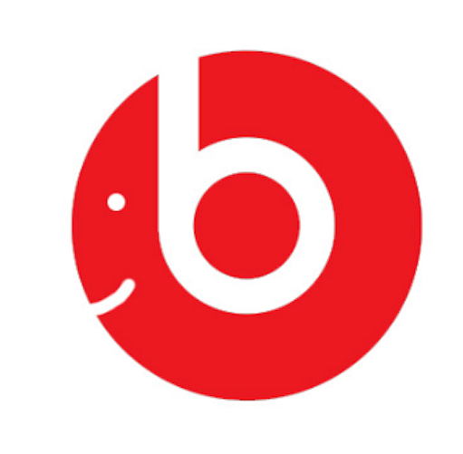
Can you see the hidden image in it? If not, maybe this will help:
via: Imgur
See it now?
It’s a happy person wearing beats headphones! I can only assume those headphones also have a clever logo, and so on, and so on…
Unilever
via: LogoPedia
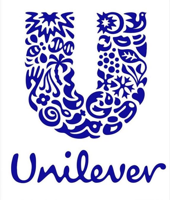
Unilever produces about a gazillion products, which makes it hard to keep track of everything they do. Lucky for us, there are symbols for nearly everything they make right in their logo.
Northwest Airlines
via: Imgur
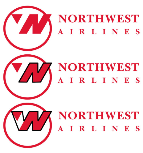
This logo is actually brilliant in three different ways:
First, there’s an “N” that stands for “Northwest.”
Second, there’s a “W” (because NW means “northwest”).
Last (and most clever of all), the tiny triangle to the left of the “N” is pointing — you guessed it! Northwest!
Here’s another logo that makes brilliant use of white space…
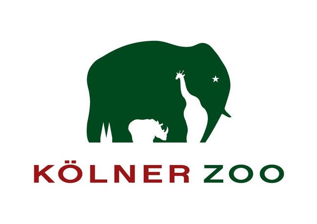
Kölner Zoo
via: Wikipedia
The hidden logo with an elephant’s silhouette is defined by a giraffe and rhinoceros; the negative space of the animal’s hind legs are cleverly shaped by the twin spires of Cologne Cathedral. There is no explanation as to why the elephant has a star for an eye, but I suppose it’s a nice touch.
Coca-Cola
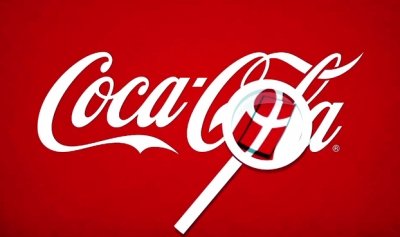
via: Diply
This one might take some work since the hidden image is not one most Americans would be familiar with. But hidden in the Coca-Cola logo is actually the flag of Denmark. This wasn’t the original intention, but once they discovered the Danish flag, which has been named the happiest country on Earth, they set up a media stunt in Denmark’s biggest airport where they welcomed people with flags. Why they didn’t welcome them with Coke is still a mystery.
The Guild of Food Writers
via: Imgur
What do you see when you look at this minimalistic logo? A spoon, or the nib of a fountain pen?
Trick question! They’re both there.
CNN (in Arabid)
via: CNN
Here’s another example of a logo that works in Arabic.
They seamlessly integrated the CNN logo you recognize into the Arabic version.
Hyundai
via: Imgur
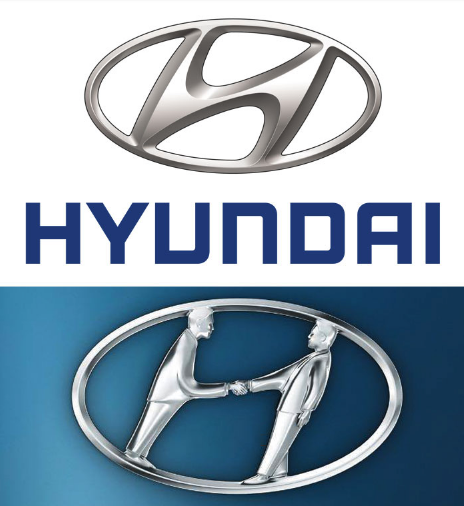
Obviously, the Hyundai logo is a stylized letter H, but that’s not the only meaning behind the logo. It was designed to resemble two people — the customer and the dealer — shaking hands.
And that’s not the only vehicular logo with a hidden meaning…
Subaru
via: Twitter
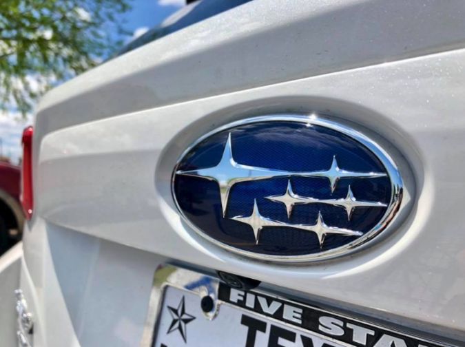
Subaru also has a meaning that you might not have realized. “Subaru” is the Japanese name for the Pleiades star cluster, also called “The Seven Sisters.” That’s why the stars are there.
But you might have noticed there are only six stars in the logo. That’s because according to tradition, one of the Seven Sisters is always invisible.
Galeries Lafayette
via: Imgur
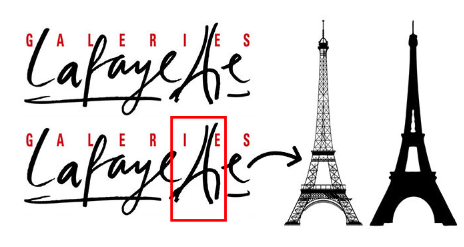
I’m guessing you probably could have spotted this hidden image without the bright red rectangle, but it’s included just in case.
This logo is for a French department store chain. As you may have guessed, its flagship store is located in Paris.
Gillette

via: Gillette
Using your “razor sharp” focus, you will notice that the “G” and “I” have been perfectly cut to represent the sharpness and precision of the razors.
Milwaukee Brewers
via: Imgur
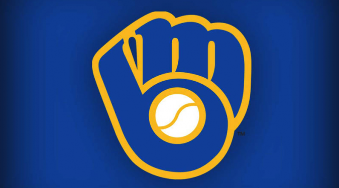
This is the logo the Milwaukee Brewers used from 1978 to 1993. At first, you probably see a baseball mitt catching a ball.
Look closely, though, and you’ll see that the mitt is actually made out of two letters: M and B (for Milwaukee Brewers, obviously).
I’m gonna call this logo a home run.
Quiksilver
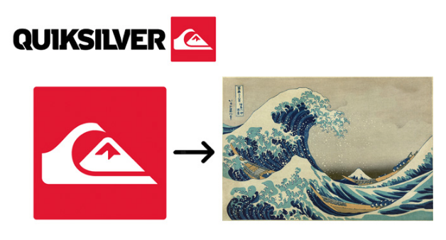
This is another logo with multiple interesting details. First of all, the Quiksilver logo itself is a stylized version of the famous woodblock print “The Great Wave off Kanagawa.”
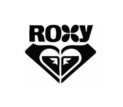
Secondly, here’s what happens when you put two Quiksilver logos together…
Roxy
via: Imgur
It forms the logo for Roxy (whose parent company is Quiksilver).
Also, it’s heart. Isn’t that nice?
London Symphony Orchestra
via: Imgur
I know what you’re thinking.
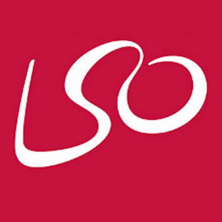
It’s an L, an S, and O. Stands for London Symphony Orchestra. Nothing too special, right?
Not so fast.
via: Imgur
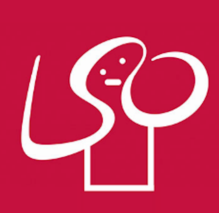
It’s actually a stylized image of a conductor raising their hands to conduct the orchestra!
How do people think of these things?!
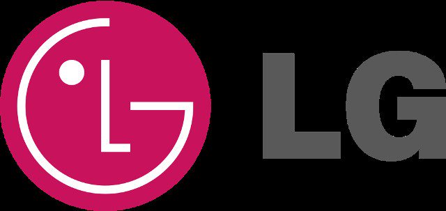
LG
via: Sarahwakfocus
Feel like playing Pac-Man? All you have to do is tilt it a little to the right and then shift the “nose” upwards. Life is good.
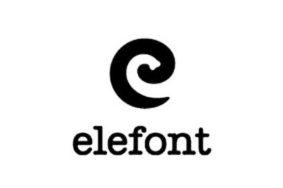
Elefont
via: Pinterest
This typeface designer went for simple yet effective with part of an elephant’s trunk formed in the negative space inside the letter “e.”


