Like there are goods and bads in everything, there are brands that try their best to give what the consumers deserve and brand that only cares about their own benefit. Some brands even put terms and conditions in a tiny text so that the consumers wouldn’t notice the negative side of the product.
While it may be an obvious fact that companies look for ways to easily earn money, there are companies that do it with a conscience. But some of them just don’t care about the moral and ethical values.
However, most consumers have realized that manufacturers aren’t always honest and truthful. Consumers can get plenty of information easily so they don’t get easily fooled.
So, watch out, companies. You can try to make things look like something they are not but we weren’t born yesterday. At the end of the day, it’s up to their conscience to deliver what they promised.
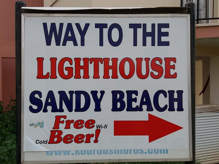
1. When they dangled the phrase “Free Beer”
Hey, do you want to go to a party with free beer? Who doesn’t? Oh, wait, that very misleading sign actually says “Free Wi-Fi, Cold Beer”. Of course, it was actually a pretty transparent ploy to catch your attention.
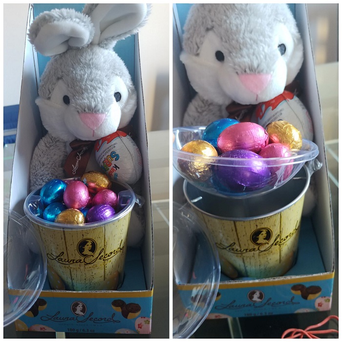
2. When they tried to make a tiny portion size look big
This old trick makes you think you’re getting a nice big portion of chocolate. Shame on you, manufacturers. You probably just ruined someone’s childhood with your skimpy portions. That child will remember the Easter Bunny as a big fat liar.
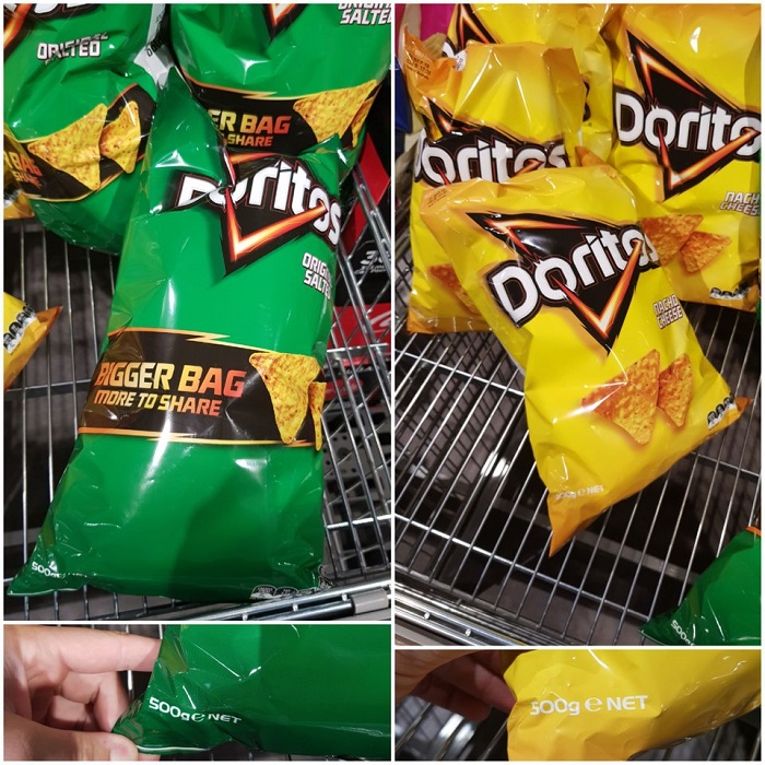
3. When their “bigger” wasn’t really better
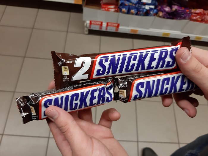
4. When they tried to tell us Snickers bars were double size
Oh, come on, Snickers. Did you really think that no one was going to do a size comparison? If you want to get away with it, don’t put all the candy bars on the same shelf.
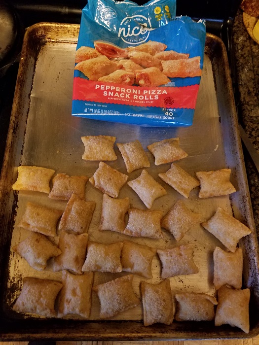
5. When “approximately 40 inches” actually meant 28
“Approximately 40″ doesn’t actually mean anything, so it’s a sneaky way of making people think they know what they’re getting. “Approximately 40″ could mean any number, really. After all, 1,000 is pretty close to 40 on a scale of one to one million.
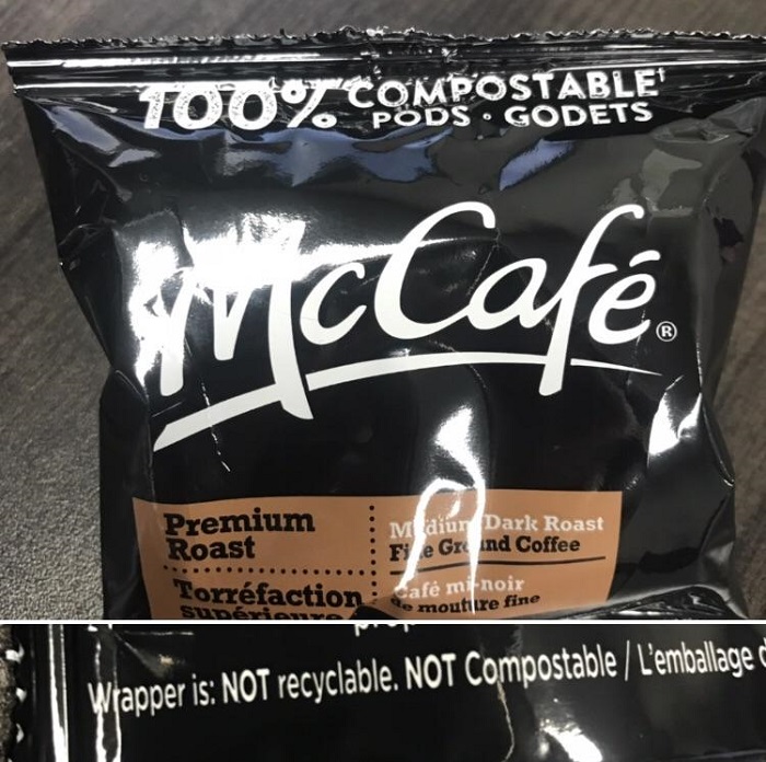
6. When they said this packaging was biodegradable
Well, this one is just a plain lie. Why put “biodegradable” on an obviously plastic package? Because people make an effort to buy products that are earth-friendly. It doesn’t actually matter if your package is really biodegradable or not. It’s whatever gets the product off the shelf.
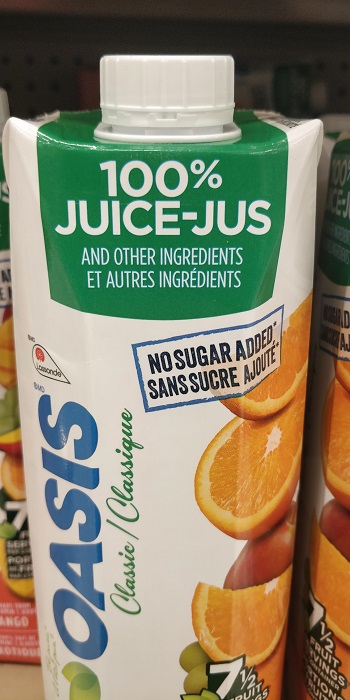
7. When they thought we wouldn’t read past the first line
This product proclaims it’s “100 percent juice,”, but read the fine print. This is the equivalent of coughing into your fist to hide the end of a sentence. “It’s 100 percent juice COUGH COUGH and other ingredients.”
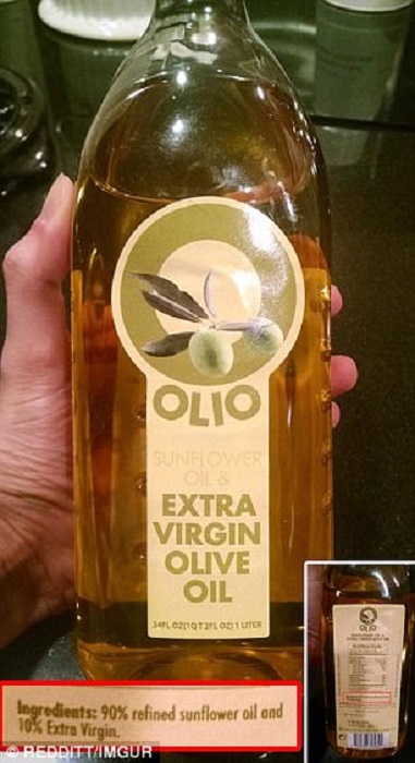
8. When this olive oil was actually 90 percent sunflower oil
Wait, what do you mean this bottle labeled “olive oil” with the picture of olives on it is actually…almost entirely sunflower oil? Oh yes, there’s the label…in almost transparent writing that you have to squint to see.
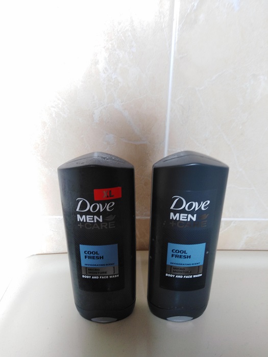
9. When they said they were resizing
Oh look, Dove Men came out with a new size of body wash! It costs a few extra dollars, but it’s worth it for more product, right? Except for the fact that those red letters don’t mean anything. You’re just paying additional money for the letters.
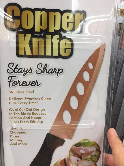
10. When this knife was made of copper and also steel
This knife is so fancy, isn’t it? The letters at the top proclaim that it’s a COPPER KNIFE. Apparently, you can call something anything you want as long as you put it on a label. Look at my fancy diamond knife…it’s just stainless steel.
11. When the label hid how much product we were getting
Look at this full tube of deodorant! It will last me for months and months. Well, actually, if you peel the label off, you can see that it’s only about one-third full.
12. When the free kettle wasn’t really free
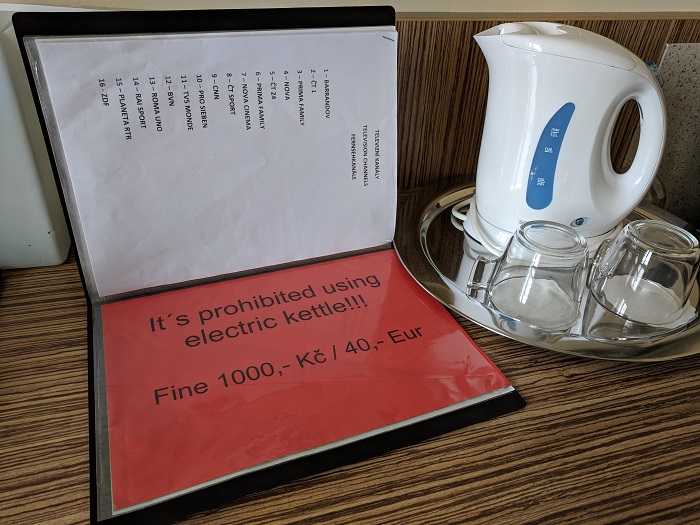
When you check into this hotel, you have a kettle in your room, obviously for free use. But if you look in the binder, you’ll actually find there’s a fine for using the kettle. The free kettle in your room.
13. When the portions didn’t fit the box
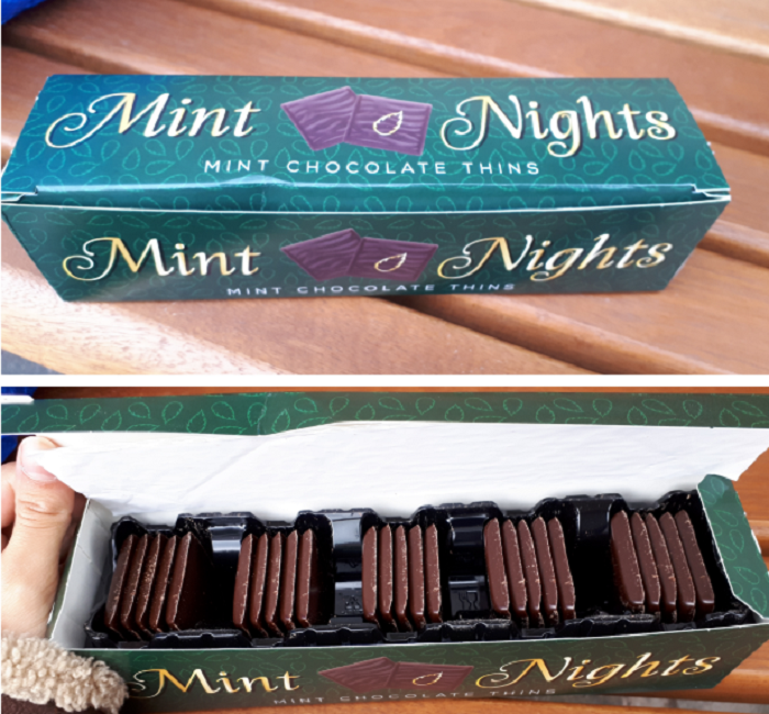
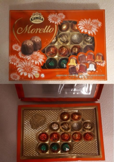
This has got to be the ultimate disappointment, buying a nice big box of chocolates only to find that it has big empty spots interspersed all the way through. In fact, that box is only about 50 percent full.
14. When they disguised an ad as an emergency alert
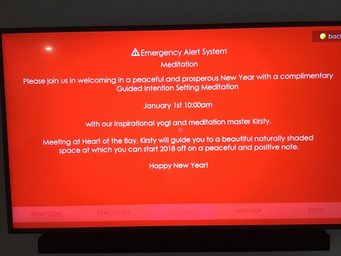
This is a pretty low move. Getting people to look at your ad by scaring them about an emergency is incredibly tacky. Ironically, it’s for a service that is supposed to help them relax.
15. When they tried to make food look better than it was
If your method of getting me to buy your food is by lying to me, it makes me think your food really isn’t that good. I wonder how much they charged for a few strips of meat and cheese.
16. When they tried to charge 40 cents a minute for parking
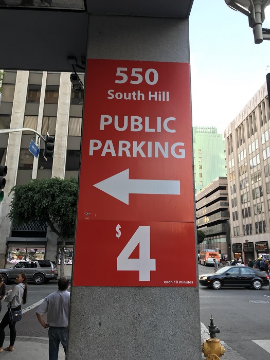
Four dollars for parking sounds like a great deal, especially in the middle of a city. But whoops, that’s actually $4 for 10 minutes. Considering no one actually uses a parking garage for 10 minutes, that’s a rip-off.
17. When they disguised ads as parking citations
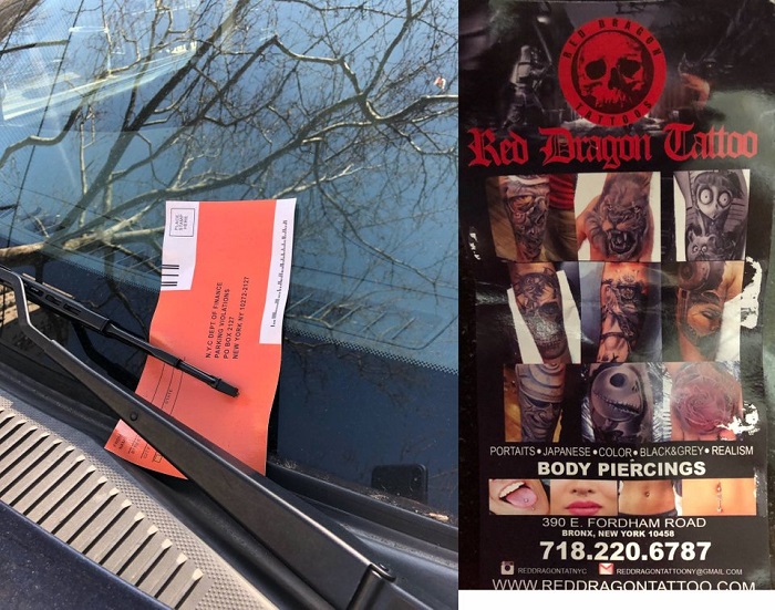
This is a perfect way to make all prospective clients instantly hate you. Getting them in a bad mood because they think they’ve gotten a parking ticket is poor advertising.
18. When they hid the right download button in a bunch of fakes
This isn’t clever as much as just annoying. You have to find the right download button in a host of fakes. Clicking the wrong one means opening a pop-up ad.
19. When they flat-out lied
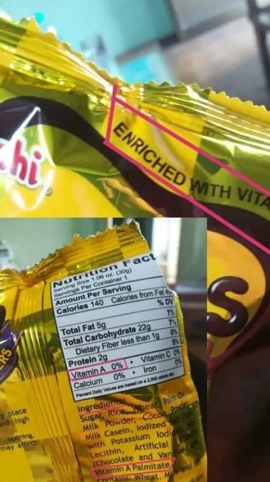
“Enriched with vitamin A” makes people feel like they’re getting something at least marginally healthy. But it turns out it’s a total lie — all you have to do is look at the nutrition information.
20. When there were terms and conditions
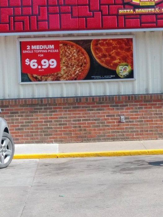
Seven dollars for two pizzas sounds like a great deal. It might be for one pizza, too, but that’s still some sneaky fine print. There’s no need to try to trick your customers.
21. More optical illusions
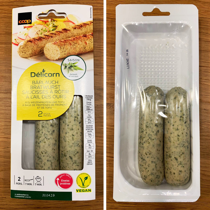
Hope you weren’t expecting a foot-long sausage because that’s not what you’re going to get. It appears that by placing the packaging over the clear display, they could get away with sausages that are actually half the size of what they appear.
22. Oh, you wanted an entire bottle?
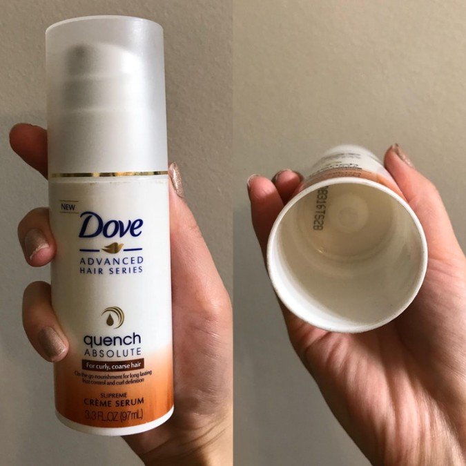
Oh, that large bottle of hair product you purchased? Turns out, it’s only around half full. By sneakily hiding the contents behind packaging, it seems that this is a lot of companies’ go-to move.
23. Not misleading at all
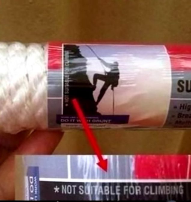
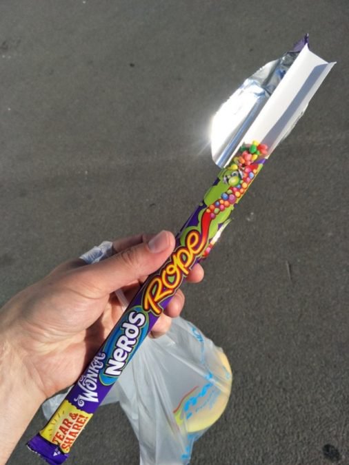
If you were looking for rope for some rock climbing and saw this packaging – you’d probably think you were good to go, right? Well, apparently not. Do they just like rock climbing? Are they trying to kill someone? What’s with this decision?
24. People already don’t like the dentist
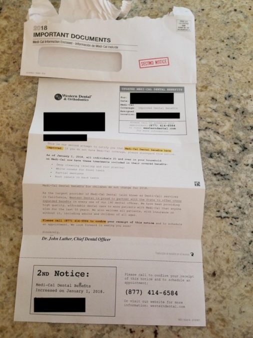
As if you couldn’t dislike going to the dentist more, they go ahead and send you an ad that looks like important tax documents. Seriously? First, you scam me, now you want to stick sharp objects in my mouth? No thanks.
25. Thank you for all the…oh…
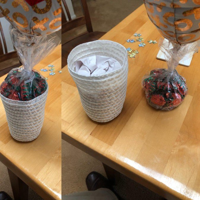
Wouldn’t you be so excited to get this adorable bag of chocolates with a balloon? So sweet! And wow! So much chocolate in this big container. Oh, wait. No. No, there’s not.
26. So many darts! Not.
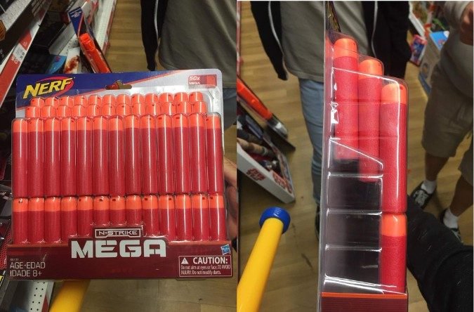
With this mega pack of foam darts, you’ll have dart fun for weeks! Well, you’re actually only getting about half of what you think you are, so make that maybe one week instead.
27. “View of the church”
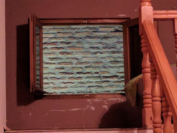
This Airbnb listing said that there was a view of the neighboring church. And while they weren’t lying, it’s not exactly being truthful is it? No one wants to see a close up view of the brick wall of the church from the bedroom. And you don’t even get a real window?! Double lose.
28. Except not.
Somebody’s interest might be piqued when they see this ad, thinking that they can finally get that university degree or diploma that they wanted. But if you look closely, you’ll see that they’ve sneakily added the word “equivalent” in between “University” and “Degrees.”
29. The fake smudge
Notice that “smudge” over the “P” in “OPEN”? Yeah, that’s not an accident. They want you to think there’s something on your phone screen, so when you go to rub it off, you actually click on their ad. So not cool.
30. Deodorant companies are the worst
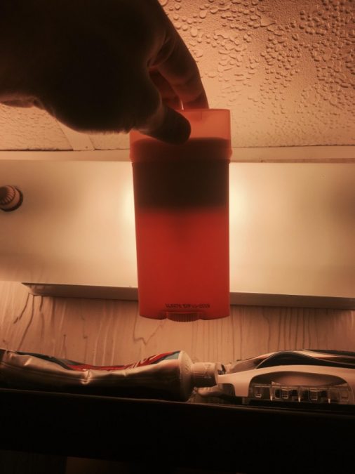
This is what a new stick of deodorant looks like without its packaging. It turns out that deodorant companies seem to be one of the biggest culprits of consumer deception. Just make the packaging match what’s inside and stop the lying!
31. Googly-eyed disappointment
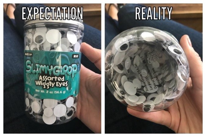
How is this type of packaging and lies even legal? No, really? It seems criminal, don’t you think? Here’s yet another example of getting away with selling less under the guise that you’re selling much more.
32. So not the same
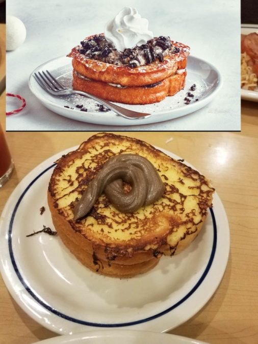
IHOP lured this person in because of their enticing-looking chocolate-stuffed French toast. When you look at the photo in the menu, it sure looks delicious! But, when it shows up at the table – it looks like a dog had an accident on top.
33. But not really.
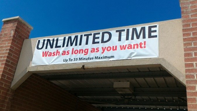
“Wash as long as you want!” this sign exclaims. And what they mean by that is “as long as you want as long as it’s under 35 minutes). So many things are deceiving about this sign.
34. Duped
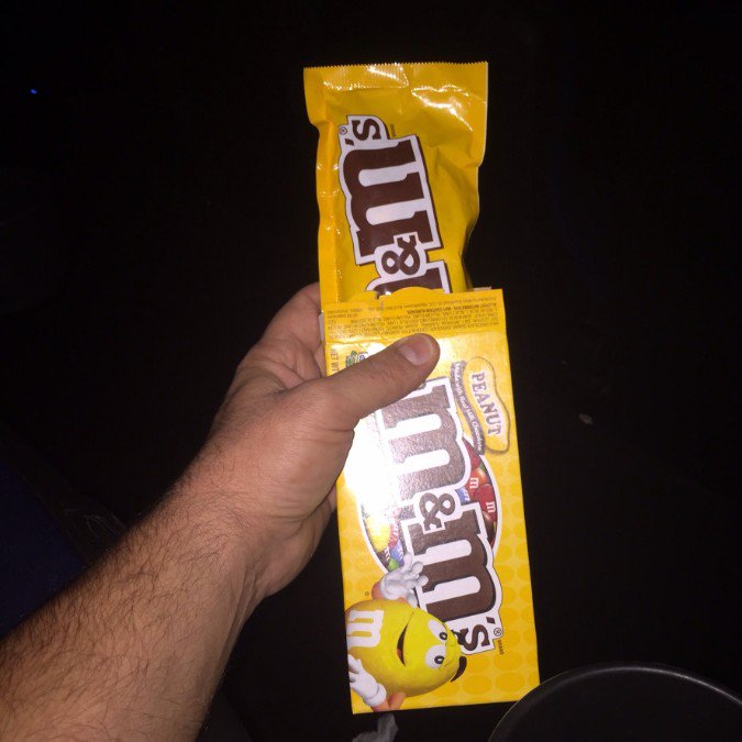
Surprise! Inside that jumbo pack of M&Ms is actually just a regular bag of M&Ms! Not only is this seriously disappointing, but it’s such a waste of plastic and paper. Come on, M&Ms. Get it together.
35. Sneaky, sneaky
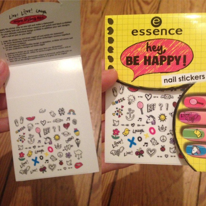
The list continues with more disguising the lack of product inside with more package-trickery. This person thought they were getting nail stickers for fingers and toes for days! But, no.
36. Evil
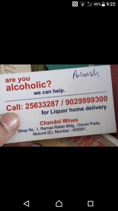
If someone is an alcoholic, the last thing you should do is “help” them by selling them more alcohol. In fact, they’ll deliver alcohol straight to your home, you alcoholic!
37. More waste of paper and plastic
It seems like it would be cheaper to just put the right amount of candy in the packaging than producing the extra packaging in the first place. Is the whole entire point for deception?
38. What you see is what you get.
One would think that because of the rectangular package shape, that you’d receive more chocolate than what you see behind the clear plastic window. But, that would just be wishful thinking.
39. That’s what the Stanley Cup looks like, right?
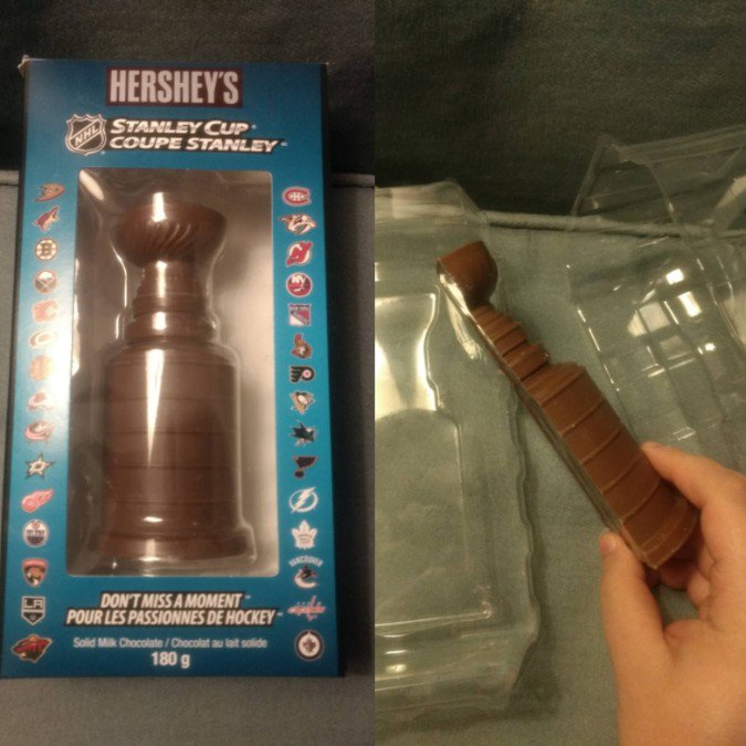
To celebrate a Stanley Cup win, wouldn’t it be fun to munch on a chocolate bar in the shape of the Stanley Cup? Well, with this chocolate bar, you’ll only be eating half of the trophy.
40. What the?!
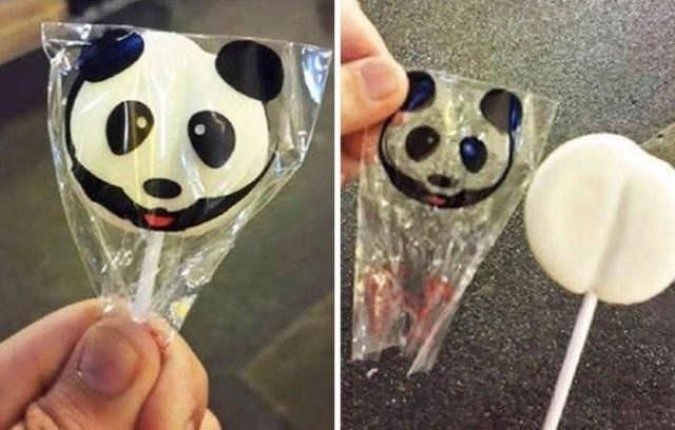
An adorable panda sucker would be exciting to receive as a kid or anyone really! Imagine the total disappointment when you realize it’s just the packaging that has the panda face and now you have a plain white boring sucker. Boo.
41. Gotcha!
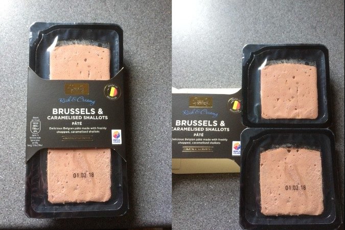
If you’re buying pate for a party, you’d think you’d be purchasing enough for the entire crowd. Then, you go to open it only to find that you are actually missing a quarter of what you thought you had.
42. Guess we’ll never know
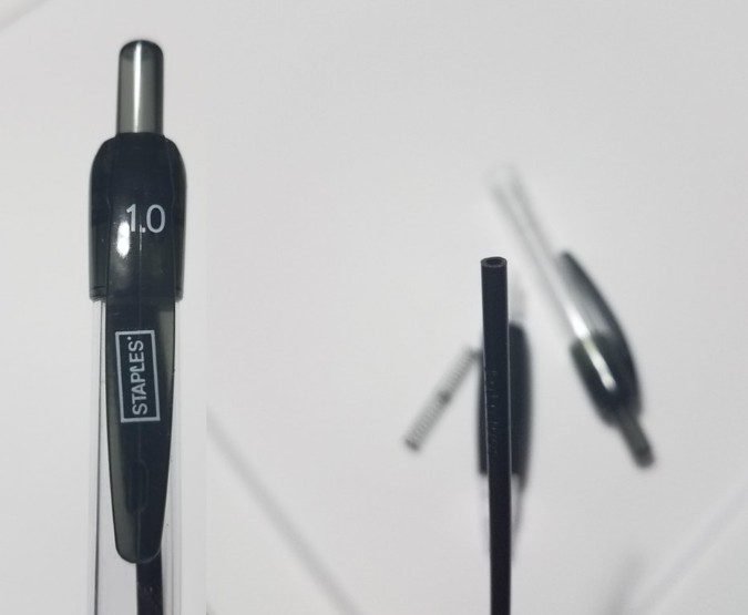
This pen has a black inkwell, so that way – it always looks full. But the problem with this is, we’ll never know how much was in it to begin with. From what we’ve seen so far? We’re going to guess it was basically empty.
43. This is just cruel
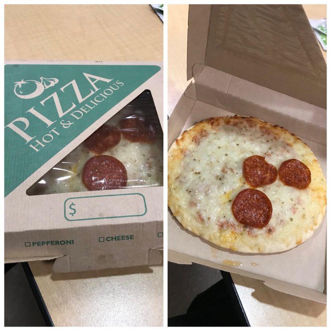
A delicious pepperoni pizza for dinner can be a real treat. Until you open it only to discover that those three pepperonis peeking through the window are literally the only ones on it.
44. Pool of lies
Want to entertain a bunch of kids in your backyard at the fun new water park you bought? Welp. That’s not going to happen! Because it’s actually less than half the size it advertises. It looks like it was actually designed for toddlers.
45. This is what ‘more’ looks like?
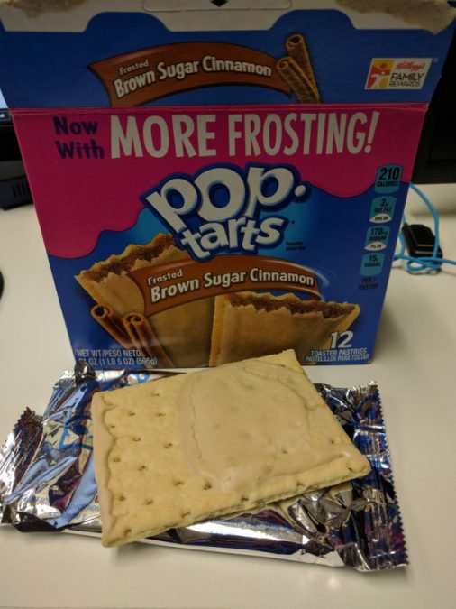
If this is what ‘more frosting’ looks like, we don’t even want to know what it looked like before. Basically only half of the Pop Tart has frosting on it and that is the meanest thing you could do to someone expecting a frosting-covered pastry treat.
46. So…3?
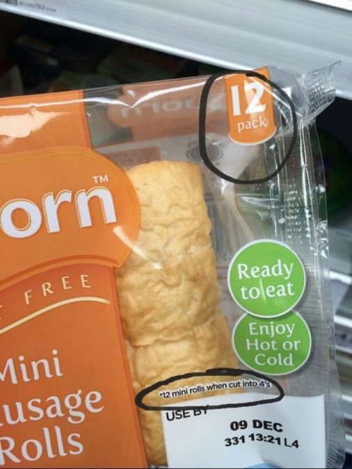
Oh, that teeny tiny asterisk letting you know the truth. There are actually only three rolls in this package, but if you cut them into fours, then you have twelve mini rolls. So, really, this package could have 18 rolls. Or, 24 rolls!
47. Not-so-long shrimp
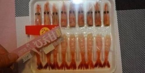
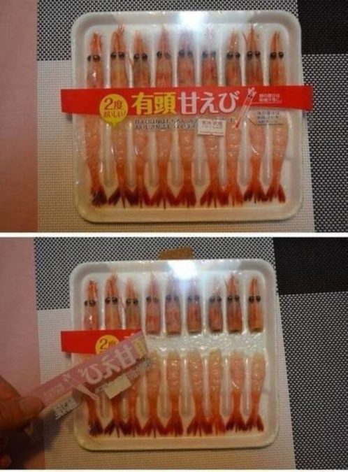
These shrimp do look strangely long and when you remove the labeling, you see why. Trickery at its finest with a label hiding the giant gap between the shrimp heads and tails.
48. That’s a giant swing
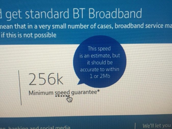
“Let’s do some math here. A Mb is equal to 1000k, so if the minimum speed is 256k, but it could vary by 1000 to 2000k, that means theoretically, the speed could just be 0,” says Twenty Two Words.
49. Just kidding!
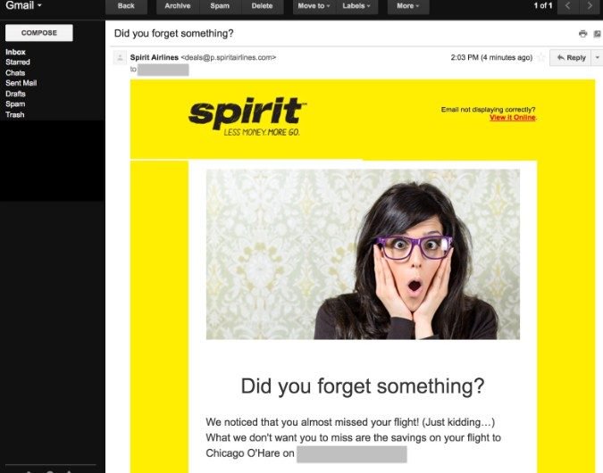
When you receive this email, Spirit Airlines makes you feel like you’re forgetting something about a trip you’re about to take. First, they get your heart rate pumping, thinking you might have forgot to hit “Confirm” or something and then they say “Just kidding!”
50. What about the warnings?!
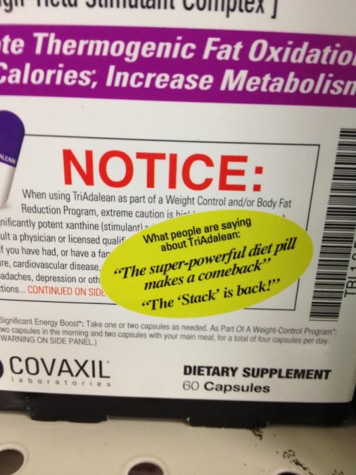
Ladies and gentlemen, look closely and you’ll see that this “sticker” is actually part of the real label. The real ridiculous thing here is that they’ve placed it over the warnings of this diet pill product. Seems like a lawsuit waiting to happen.
51. One-a-Day needs to change their name
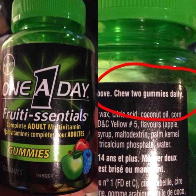
Apparently, the One-A-Day brand of vitamins’ name has nothing to do with how many vitamins you should actually be taking a day. So, don’t be fooled – they’re real name is actually “Two-A-Day.”
52. Optional is not an option
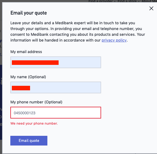
This form will not let you submit for a quote unless you give them your phone number which they claim is optional. So, now, you’re forced to give them your GD phone number and you know they’ll be calling you incessantly.
53. A fake hair
Here’s a company that placed a fake hair near the top of their ad. That way, you’ll go to remove the hair from your phone screen and unintentionally click the ad that you had no intention of clicking. So frustrating.
54. Not again
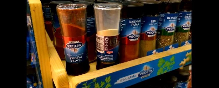
We don’t know what this foreign product is but we’re happy to see that companies in countries all around the world are scamming their consumers.


