There are challengable designs that make it to the top but some you see them and wonder if the designers were actually thinking or not. Some of them are so bad that you question the humor sense of the designer. Was it supposed to be funny? Or is it just a mistake that can never be undone?
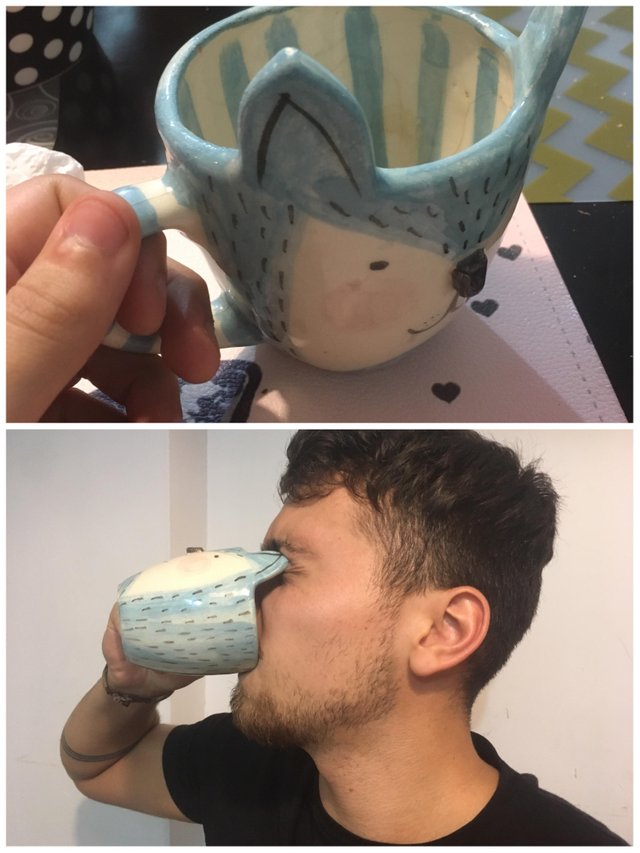
1. Keep an eye out
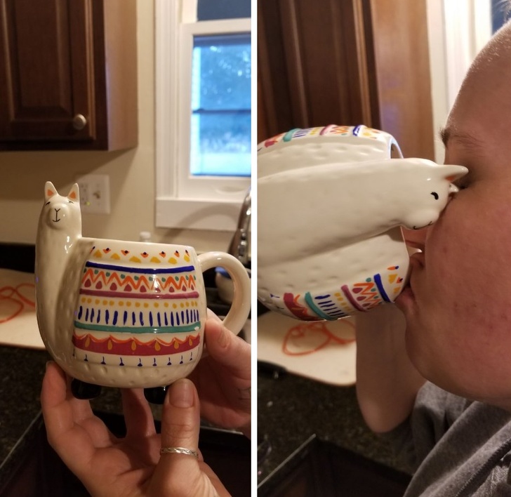
This handy mug not only delivers piping hot beverage to your mouth but also gouges out your eyes in the process.We have to admit that it’s pretty cute, it’s just not all that useful.
ADVERTISEMENT
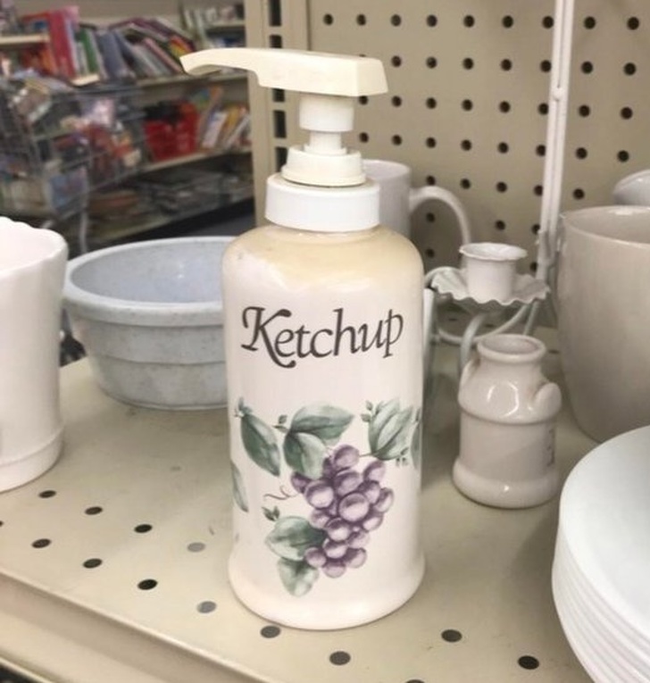
2. Decorative ketchup
We’re not sure who decided to make a ketchup dispenser that looked exactly like a soap dispenser, but we certainly hope that no one gets them mixed up.Keep this one far away from the sink.
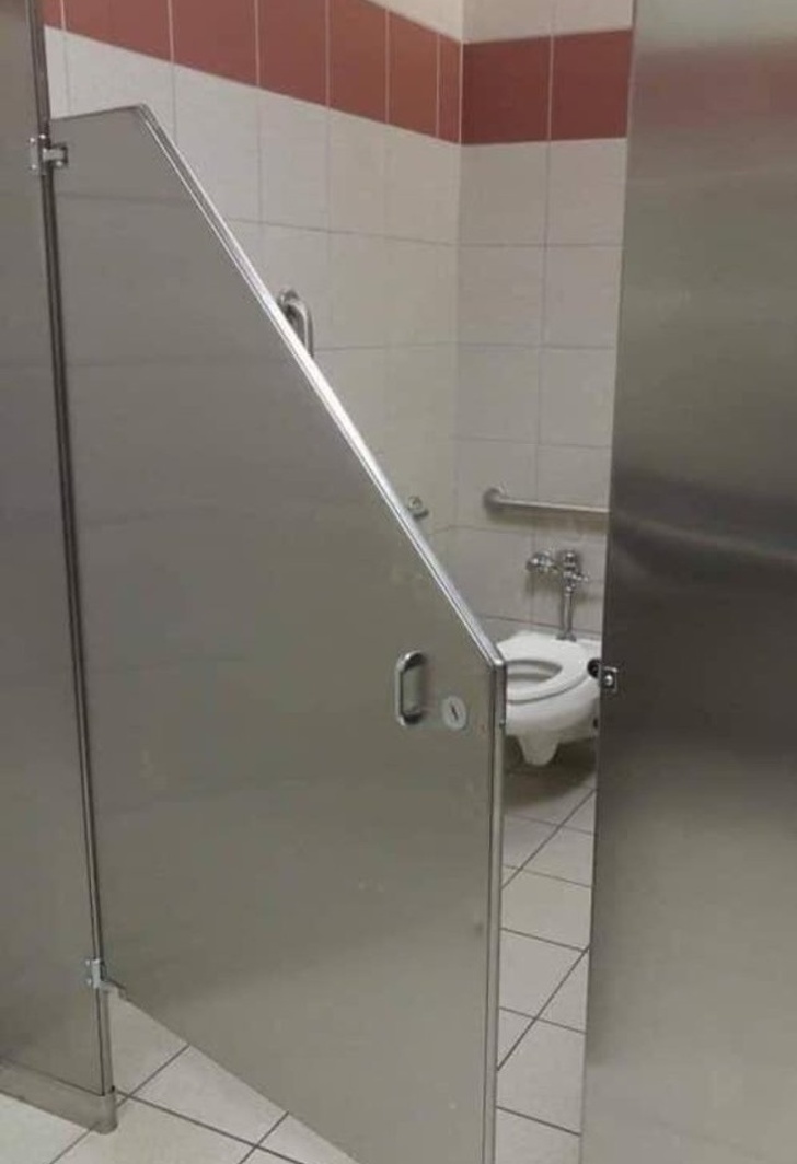
3. What ever happened to privacy?
We think those who use a handicapped stall deserve the same privacy as everyone else, especially in a public restroom.What was this door designer thinking? And why bother to even have a door in this case?
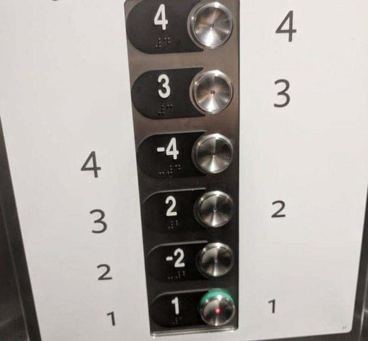
4. Going down, way down
How far down under the Earth do you think floor -4 goes?And why are the numbers in that order?
At this point, we think it’s best to use the stairs.
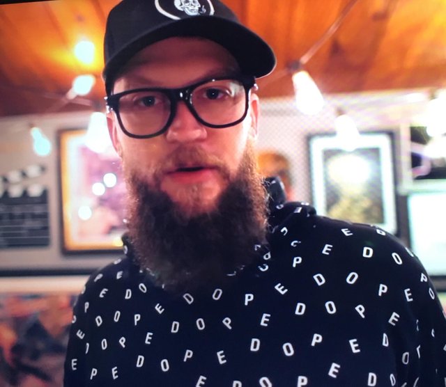
5. Dope pedo
Ok, so the shirt is supposed to say “dope,” which is funny if you don’t use the word to mean something good.Unfortunately, more people who look at this see the word “pedo” instead, which is certainly not something you want people associating with you.
6. Don’t walk towards the light
Ok, we get that your future is bright, but hopefully that’s not because you’re headed for an oncoming train.Let’s lose the train tracks here for a less creepy image of the future.
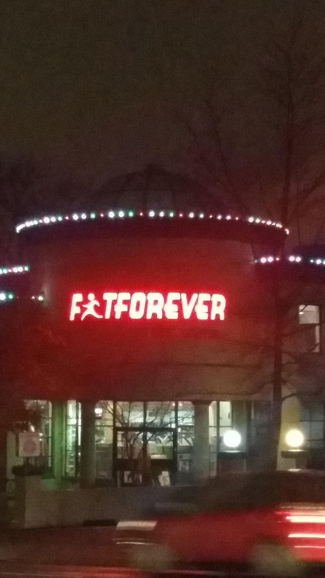
7. Fat Forever
Someone fire this logo maker.If you’re going to use an image to stand in for a letter, make sure it looks like the correct letter. Otherwise, you’re giving people the wrong idea.
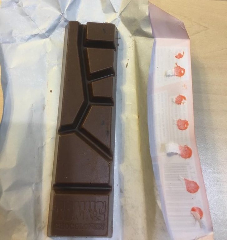
8. Not for sharing
Well, it’s unique and kind of pretty, but we wonder how exactly you share this candy bar with your friends or even go in for another piece yourself.Does chocolate really need to be this complicated?
9. Cerberus the soccer mom
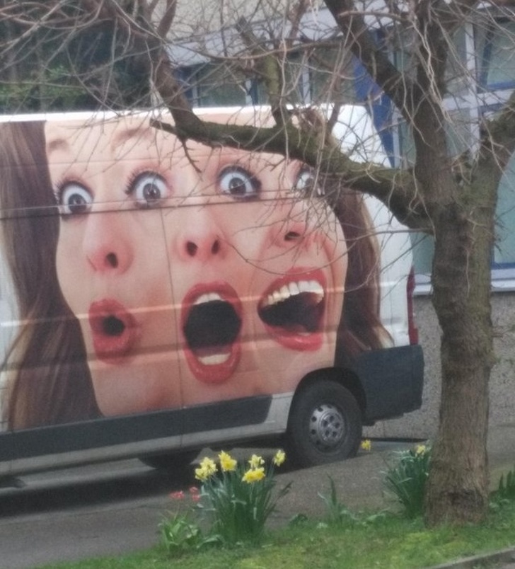
The three-headed mom van is hopefully not headed to a neighborhood near you.This is downright terrifying, especially since there are three faces and four eyes. Yikes!
10. Pearl placement
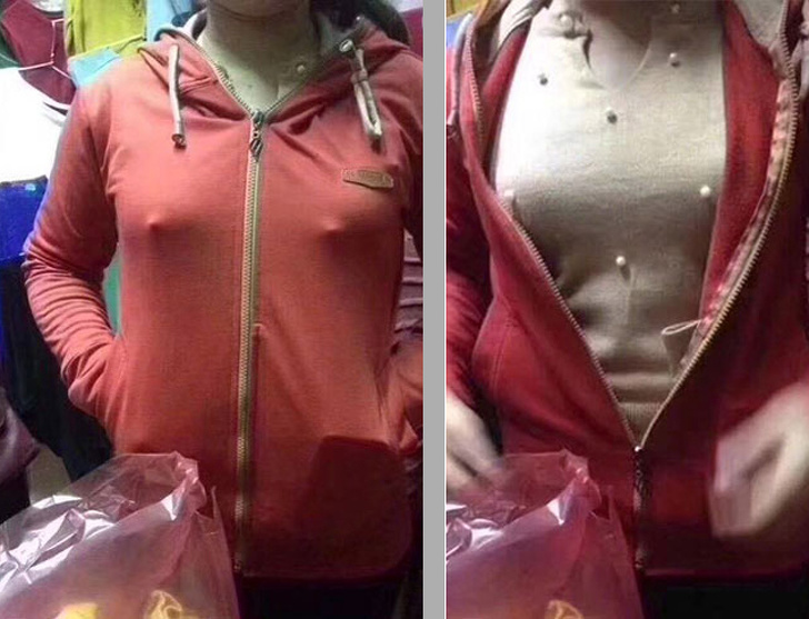
It’s not the shirt’s fault – it’s just not meant to be layered.But we have to admit that some of those pearls are in the exact wrong place.
11. Blinded by a llama
What’s up with making cups that also stab the drinker in the eye?It’s a cute piece, but there’s almost no way to drink out of this without poking yourself in the face somewhere.
12. Which way’s which?
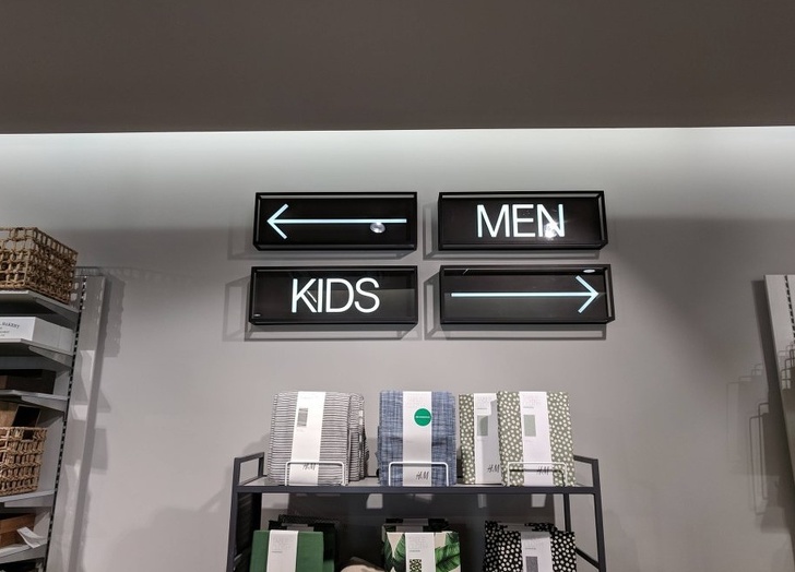
Too many arrows. Do directions really need to be this confusing?We wonder how long this signage lasted before too many men ended up in the kids changing room.
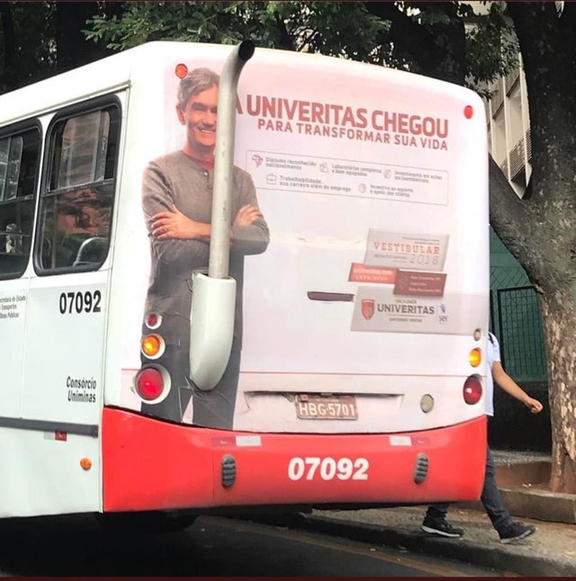
13. Pipe placement
Ok, you really have to know what you’re doing here in order for a design to come out like this, right?We have to admit that it’s pretty funny nonetheless.
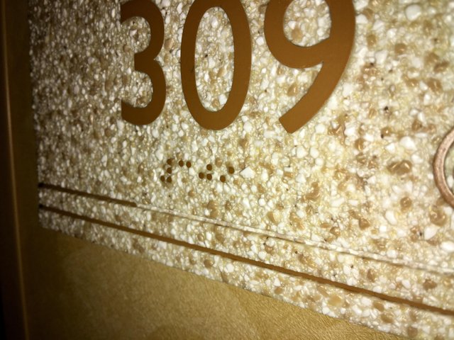
14. Terrible texture
Why would anyone put braille on a textured surface?We imagine that the blind are used to discerning braille from background, but it seems overly complicated when it just doesn’t have to be.
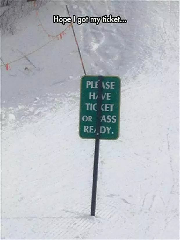
15. Hope you have you ticket
The pole goes on the back of the sign, guys.Did no one take a step back and realize this wasn’t a good idea?
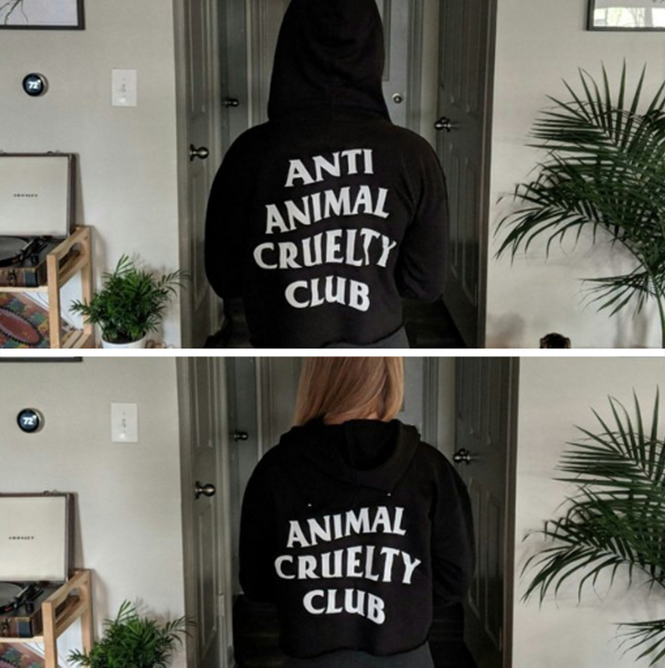
16. Hoods up
This is one one hoodie that you need to keep up all day unless you want some serious questions from animal lovers.
17. Where do those webs come from?
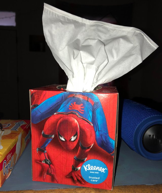
We’re not sure this is the hygenic image Kleenex was going for when they designed this packaging.
18. Sorry, we laughed
And we imagined the crew setting up the second billboard got a chuckle out of this as well.
19. Hiring or not?
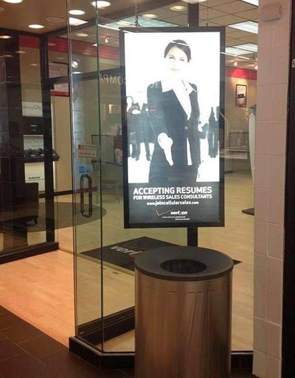
Great trash can placement if you want to look like you’re hiring but really aren’t.Otherwise, we think this company is going to have a hard time filling the position.
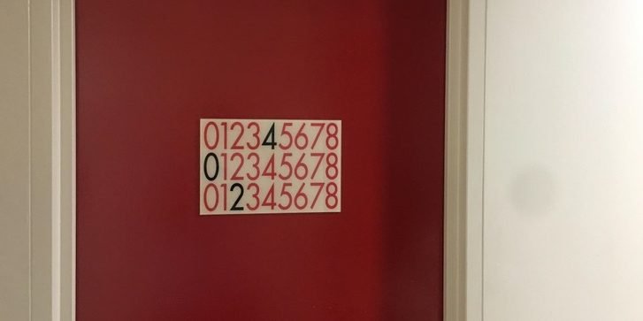
20. Room number riddle
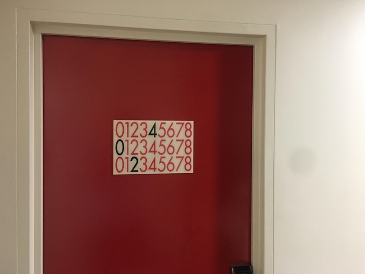
Is it really necessary to make figuring out a room number this hard?We don’t mind a a little creativity, but this is just ridiculous.
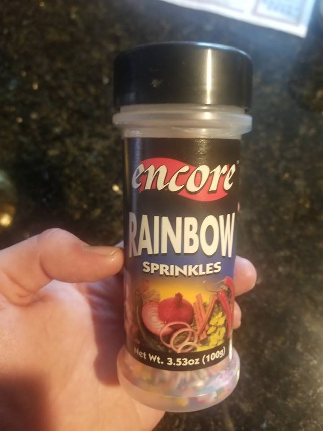
21. Sprinkle on what?
Maybe it’s just us, but we’re not huge fans of putting rainbow sprinkles on our veggies.But to be fair, we’ve never tried. Maybe this company knows something we don’t.
22. Just no
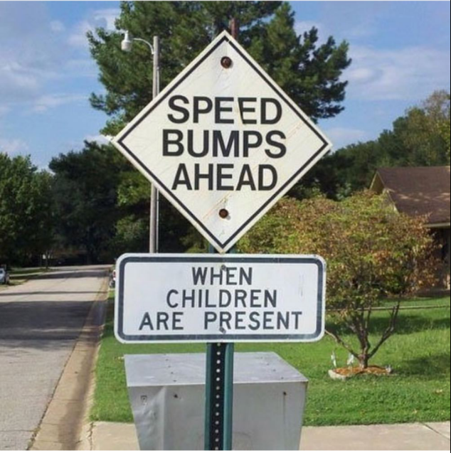
We kind of hope this is Photoshopped.Otherwise, we’re not sure how you create speedbumps only in cases when children are at play.
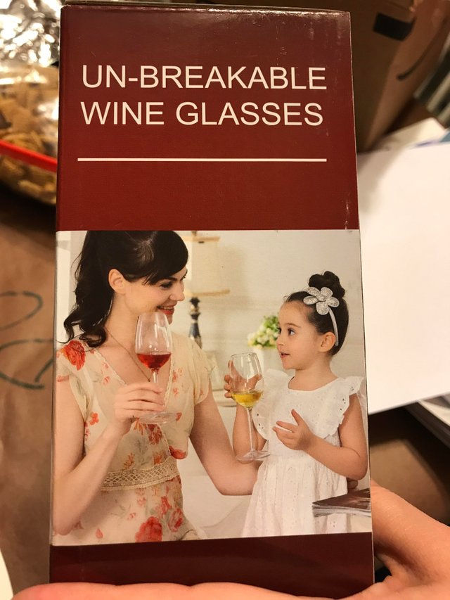
23. Mother-daughter bonding
To be fair, you don’t want your kids breaking the good wine glasses.We’re just a little concerned about whether that’s wine or apple juice in the little girl’s glass.
Also, it’s time to tell you child that you hold wine glasses by the stem, not the globe!
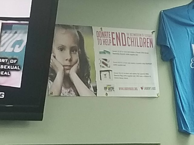
24. End children?
If you’re going to play with fonts, you really need to take a step back and read your text.Otherwise you might give people the impression that you’d like to end children, which is not a popular cause when it comes to donating money.
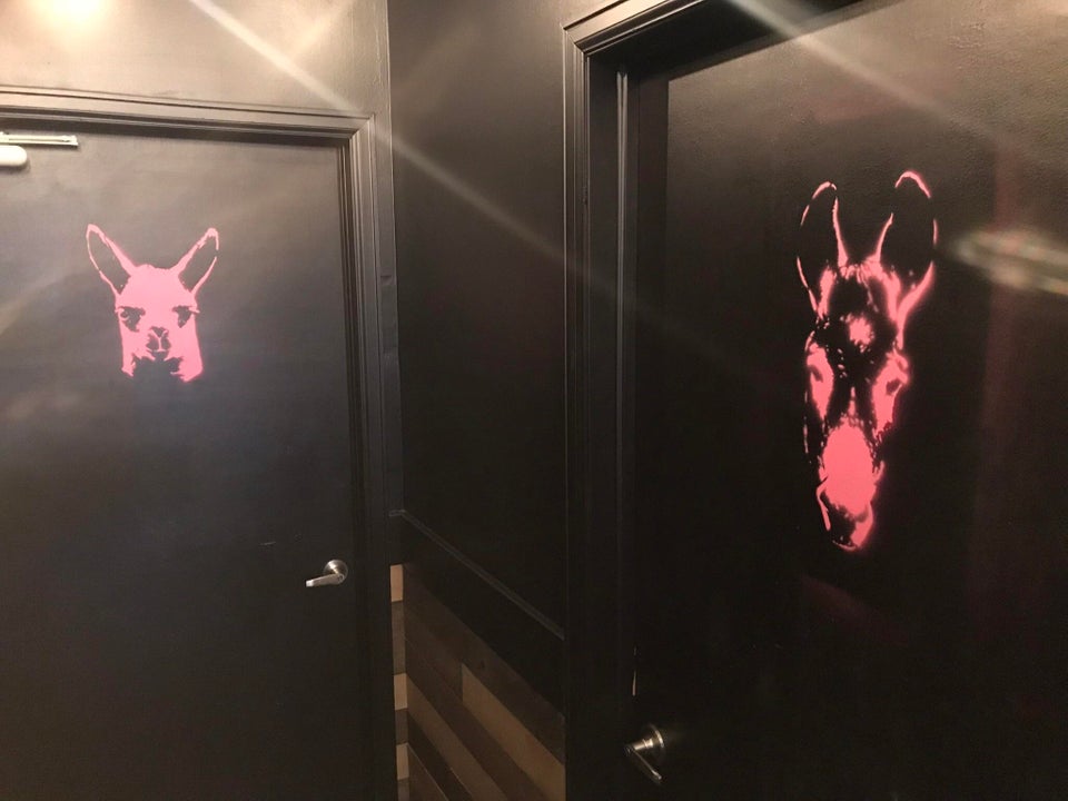
25. So are they unisex?
Are llamas for ladies and mules for men? Or is it mules for matrons and llamas for lads?We’re just going to hold it because this is far too confusing.
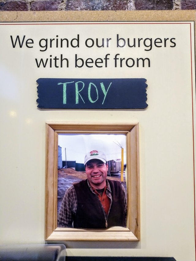
26. Poor Troy
We assume Troy raised the cows and we’re not indulging in cannibalism here.But this sign really needs a re-think because we’re pretty sure our appetite is gone now.
ADVERTISEMENT
27. Chilean craftsmanship
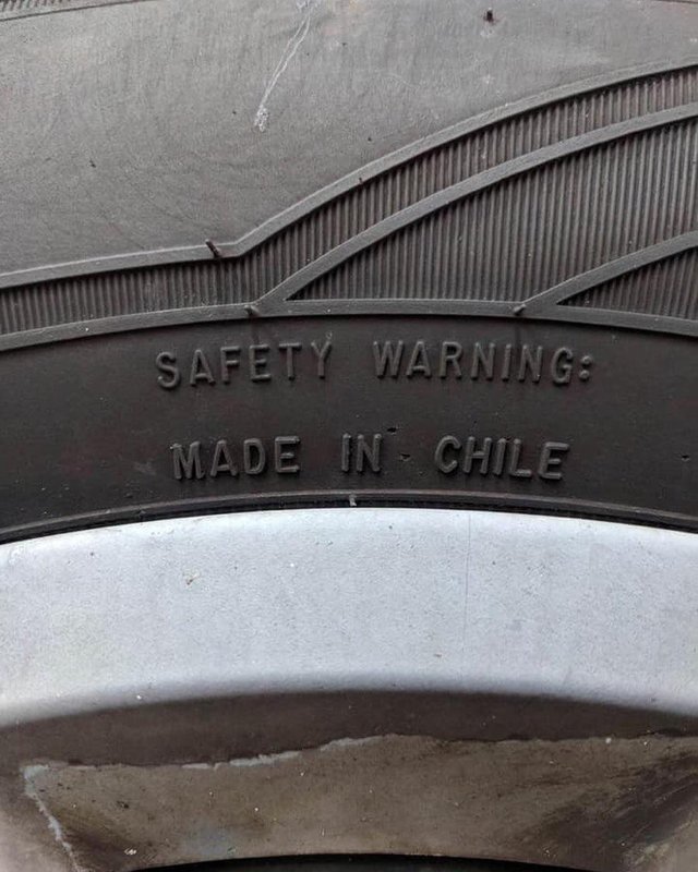
Is there something we should know about Chile?If not, maybe someone should have given some extra thought to how closely these sentences appeared together as well as the placement of the colon.
ADVERTISEMENT
28. A cup of what?
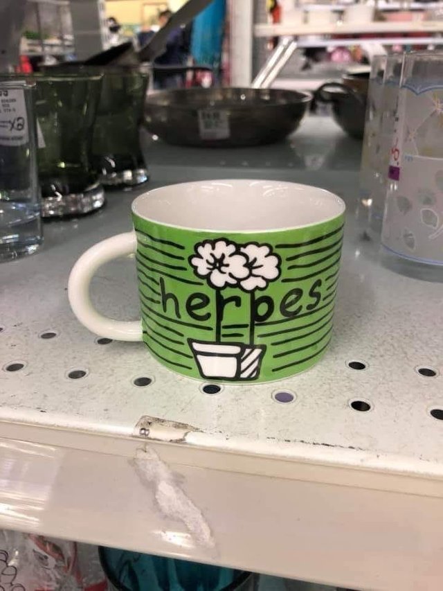
It actually took us a while to see that this mug said herbs instead of herpes.Either way, it’s a very weird thing to put on a drinking cup.
29. Go paperless or the trees get it
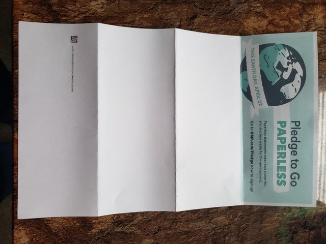
I guess this is proof that they’re willing to kill a lot of trees if you don’t go paperless.It’s really sad to see such wastefulness.
30. Interesting routine
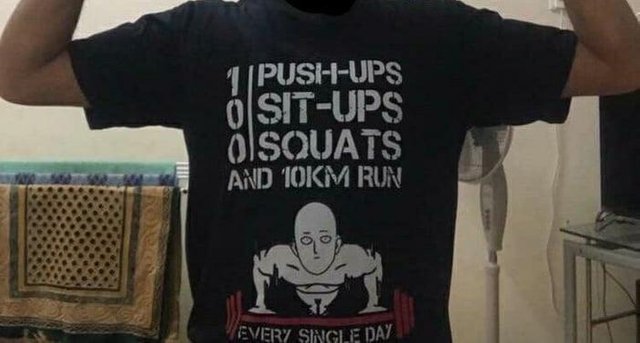
Apprently all you need is 1 push-up and a 10k a day to stay in shape.Frankly, that seems a little excessive.
We’d rather just get a sit-up or two in.
Please SHARE this with your friends and family.


